" height="38px" id="s7PhIa9un" transform="translate(30.212 21.908)" width="21px"/></svg>)
HKeMobility: Rebuilding Trust
in Public Transit
" height="59.99999755566683px" id="MM6SLOagw" transform="translate(7 11) rotate(90 34.5 30)" width="69px"/></svg>)
Client
HKeMobility
Role
Product Designer
Timeline
1 Week (Deep Dive)
HKeMobility is the official government transport app, but it suffers from a 2.1-star rating due to confusing navigation and unreliable data. In a 1-week design sprint, I diagnosed the root cause: users didn't just hate the UI, they didn't trust it. I redesigned the core navigation flow to prioritize transparency and scannability. The result is a modernized interface that reduces decision fatigue and introduces "Trust Signals" to restore user confidence.
Context
The "Ghost Bus" Crisis. An official app that citizens are afraid to rely on.
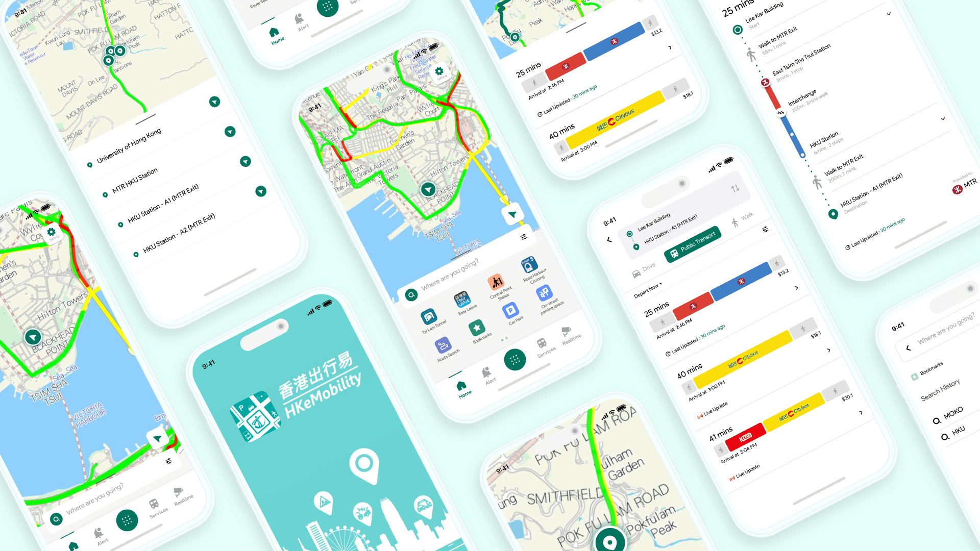
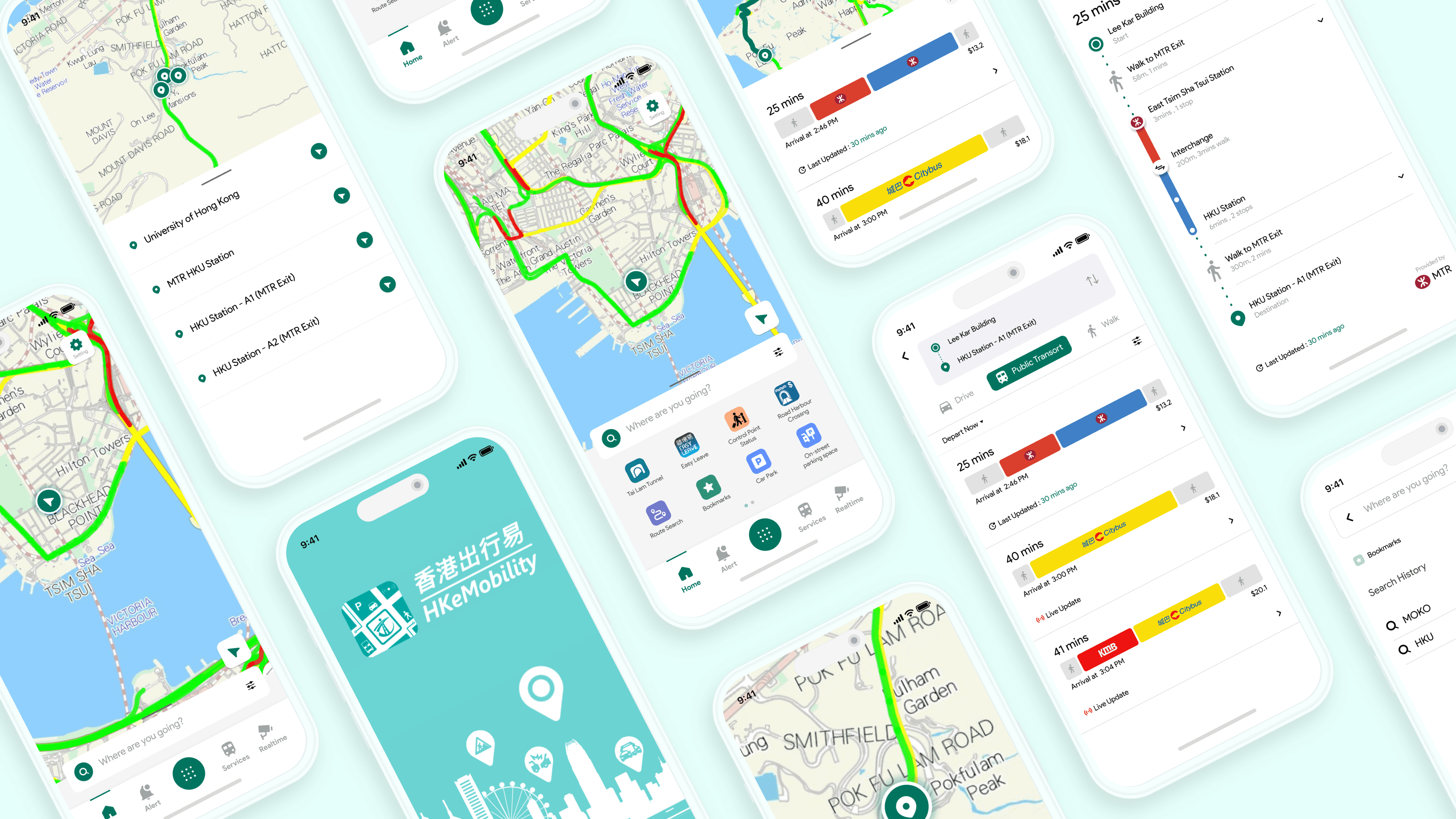
HKeMobility is supposed to be Hong Kong's all-in-one transport planner. But with a rating of 2.1 stars, it was failing its users. My audit revealed a "Money Pit" of issues: cluttered interfaces, outdated visuals, and inconsistent icons. But the biggest issue wasn't aesthetic—it was functional. Users were walking to bus stops to check times manually because they couldn't rely on the app.

▲ Initial market analysis
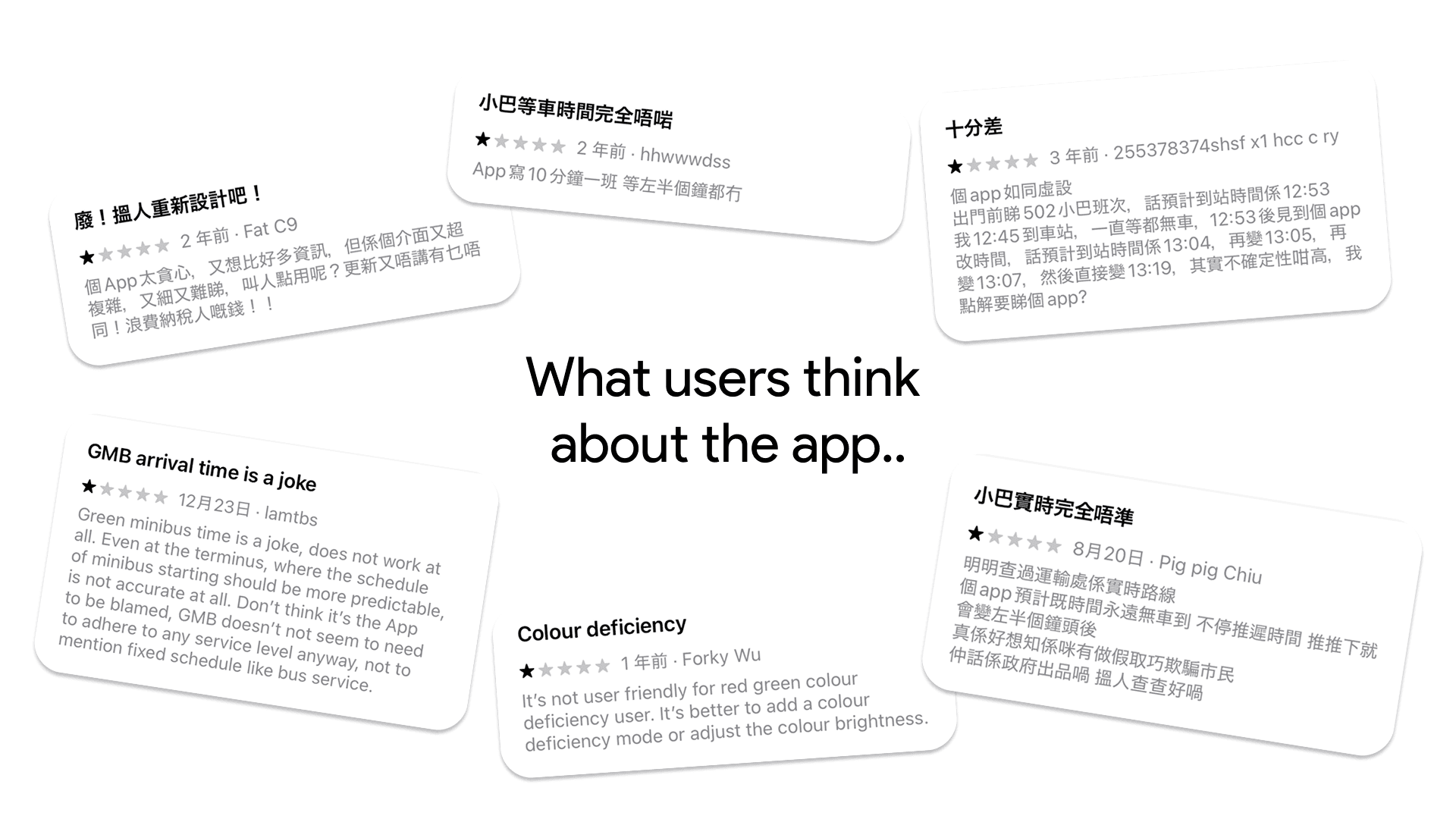
▲ User's comments from app store
" height="59.99999755566683px" id="gXFm8DZHv" transform="translate(7 11)" width="69px"/></svg>)
Problem
Cognitive Overload & Broken Trust. The interface was fighting the user.
Through an audit of app store reviews and guerilla interviews with locals, I identified three critical friction points:
" height="82px" id="D3F9kcYvK" width="82px"/></svg>)
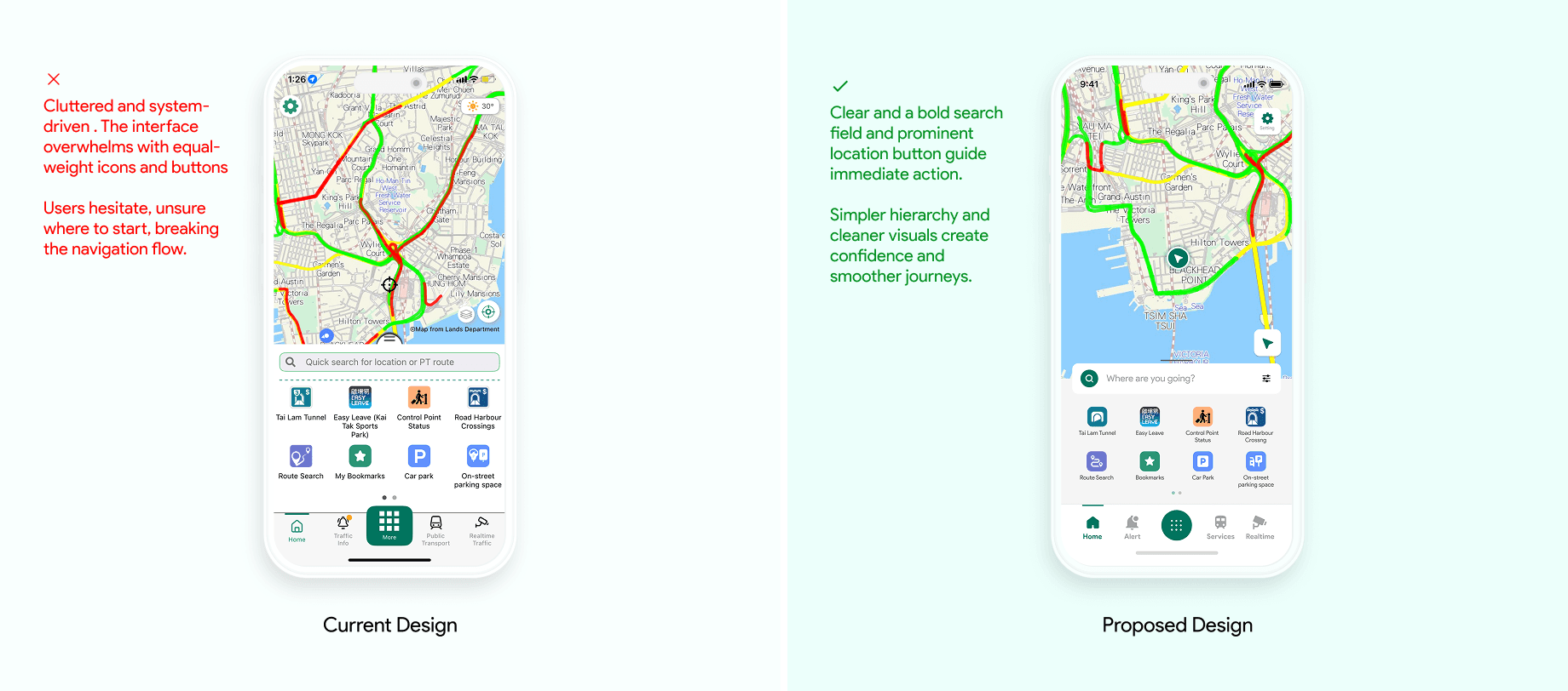
The "Split-Screen" Trap
The home screen forced a 50/50 split between a map and a list, burying the primary goal (finding a route) beneath secondary tools
Information Overload
Route results were displayed as dense text blocks with no visual hierarchy, making it impossible to scan quickly.
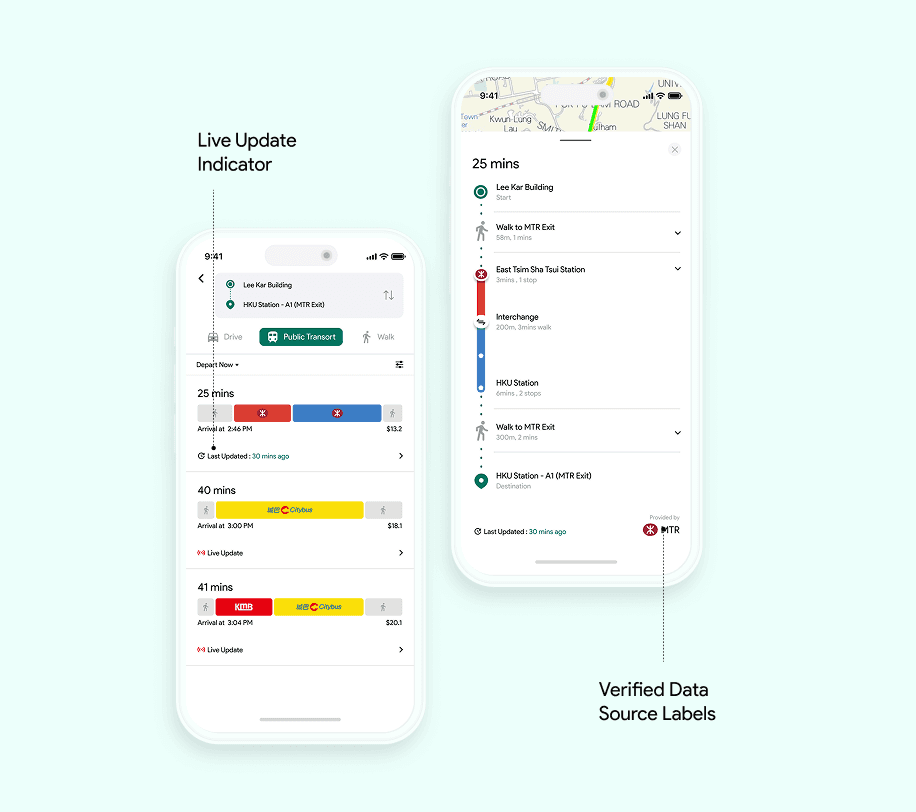
The Credibility Gap
The app often showed "ghost data"—delayed times without warning. As one user put it: "It doesn't tell me if I'm on the right track".

▲ Key frictions in navigation flow
Research Question
Strategy & Exploration
Prioritizing the "Big Bets" We can't fix everything in a week. So we fixed what matters.
Using an Impact-Effort Matrix, I prioritized features that would rebuild trust without requiring a complete backend overhaul.
The Inisght?Users don't need "more features."
They need Transparency
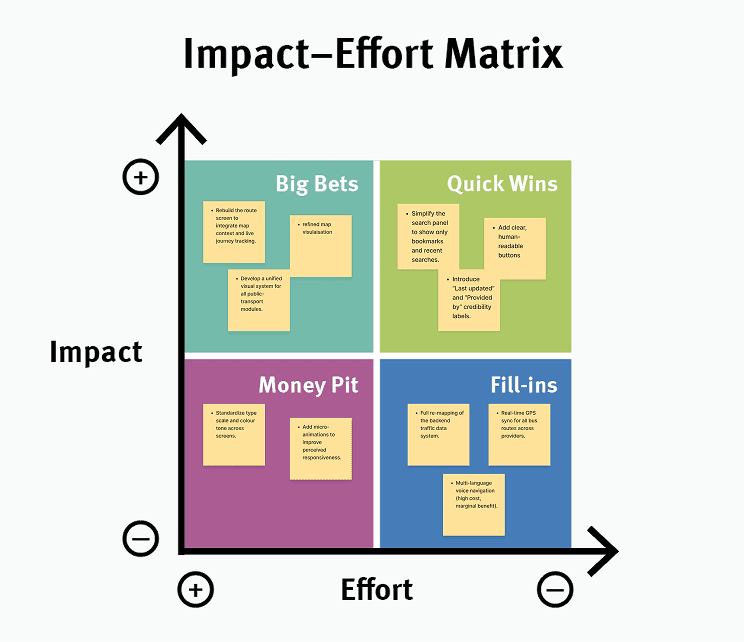
▲ Impact-Effort Matrix analysis
The Pivot:
Solution
Turning simplicity into engagement. From Search to Route in One Seamless Flow
The updated HKeMobility design improves engagement by applying Nielsen Norman’s usability principles to make the experience clear and trustworthy.

▲ The updated user flow
01
Search & Discover
02
View & Select


03
Confirm & Go
04
Credibility Update
Heuristic Impact
Turning Simplicity into Engagement
Applying Nielsen Norman’s heuristics, the redesign aims to restores trust by minimizing cognitive load. Real-time updates ensure Visibility of System Status, while intuitive layouts prioritize Recognition over Recall. This transforms a confusing interface into a transparent, frictionless tool that users can reliably adopt.


" height="49px" id="LIGo47a1Z" transform="translate(17 17)" width="49px"/></svg>)